Descrizione
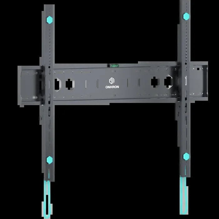
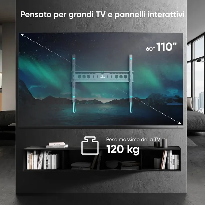
Staffa fissa per pannelli interattivi o TV 60″-110″ max 120 kg, nero UF12
p, span, h1, h2, h3, h4, h5, ul {
z-index: 4;
}
.main-content-container {
display: -webkit-box;
display: -ms-flexbox;
display: flex;
-ms-flex-wrap: wrap;
flex-wrap: wrap;
-webkit-box-pack: center;
-ms-flex-pack: center;
justify-content: center;
width: 100%;
}
#content-layout {
max-width: 1280px;
width: 100%;
font-size: 16px;
}
iframe {
max-width: 1280px;
width: 100%;
margin-bottom: 30px;
border-radius: 16px;
}
.layout-header {
position: relative;
display: -webkit-box;
display: -ms-flexbox;
display: flex;
-webkit-box-orient: vertical;
-webkit-box-direction: normal;
-ms-flex-direction: column;
flex-direction: column;
-webkit-box-align: center;
-ms-flex-align: center;
align-items: center;
-webkit-box-pack: center;
-ms-flex-pack: center;
justify-content: center;
width: 100%;
}
.layout-header__img {
width: 100%;
}
.layout-header .layout-header__content-box {
position: absolute;
display: -webkit-box;
display: -ms-flexbox;
display: flex;
-webkit-box-orient: vertical;
-webkit-box-direction: normal;
-ms-flex-direction: column;
flex-direction: column;
-webkit-box-align: center;
-ms-flex-align: center;
align-items: center;
}
@media screen and (max-width: 1024px) {
.layout-icons {
padding: 0 100px;
}
.layout-header .layout-header__content-box .layout-header__sub-title {
margin: 18px 0 !important;
}
}
.layout-icons {
display: -webkit-box;
display: -ms-flexbox;
display: flex;
-webkit-box-pack: space-evenly;
-ms-flex-pack: space-evenly;
justify-content: space-evenly;
/* padding: 0 162px; */
gap: 104px;
list-style-type: none;
margin-top: 18px !important;
margin-bottom: 0 !important;
}
@media screen and (max-width: 480px) {
.layout-icons {
gap: 10px;
padding: 0 20px;
-ms-flex-wrap: wrap;
flex-wrap: wrap;
margin-top: 0px !important;
}
}
.layout-header .layout-header__content-box .layout-header__sub-title {
font-size: clamp(0.75em, 1.696vw + 0.411em, 1.938em);
font-weight: 600;
text-align: center;
margin: 36px 0 !important;
color: #000 !important;
line-height: 1;
}
@media screen and (max-width: 480px) {
.layout-header .layout-header__content-box .layout-header__sub-title {
margin: 17px 0 !important;
}
}
.layout-icons .layout-icons__item {
display: -webkit-box;
display: -ms-flexbox;
display: flex;
-webkit-box-orient: vertical;
-webkit-box-direction: normal;
-ms-flex-direction: column;
flex-direction: column;
-webkit-box-align: center;
-ms-flex-align: center;
align-items: center;
}
@media screen and (max-width: 480px) {
.layout-icons .layout-icons__item {
width: 30%;
}
}
.layout-icons .layout-icons__item .item__img-wrapper {
height: clamp(2em, 6.786vw + 0.643em, 6.75em);
-webkit-box-sizing: border-box;
box-sizing: border-box;
}
.layout-icons .layout-icons__item .item__title {
text-align: center;
font-size: clamp(0.313em, 1.071vw + 0.098em, 1.063em);
color: #fff;
margin: 12px 0 !important;
font-weight: 600;
}
.layout-icons .layout-icons__item .item__img-wrapper .item__img {
height: 100%;
}
.layout-header .layout-header__content-box .layout-header__logo {
width: clamp(11.25em, 21.429vw + 6.964em, 26.25em);
}
.layout-header__content-wrap {
position: absolute;
display: -webkit-box;
display: -ms-flexbox;
display: flex;
-webkit-box-orient: vertical;
-webkit-box-direction: normal;
-ms-flex-direction: column;
flex-direction: column;
-webkit-box-align: center;
-ms-flex-align: center;
align-items: center;
width: 100%;
}
@media screen and (max-width: 480px) {
.layout-header__content-wrap {
text-align: center;
}
}
.layout-header__content-wrap .layout-header__logo {
width: clamp(11.25em, 21.354vw + 6.979em, 24.063em);
}
.layout-header__content-wrap .layout-header__title {
font-size: clamp(0.813em, 1.458vw + 0.521em, 1.688em);
font-weight: 500;
color: #000 !important;
text-align: center;
margin: 0.5em 0 !important;
}
@media screen and (max-width: 480px) {
.layout-header__content-wrap .layout-header__title {
text-align: center;
}
}
.layout-header__content-wrap .layout-header__subtitle {
width: 100%;
font-size: clamp(0.813em, 1.607vw + 0.491em, 1.938em);
font-weight: 400;
text-align: center;
margin: 0;
color: #000 !important;
line-height: 1;
}
@media screen and (max-width: 480px) {
.layout-header__content-wrap .layout-header__subtitle {
margin-bottom: 1em;
}
}
.layout-header_mob {
display: none;
}
.layout-icons-product {
display: -webkit-box;
display: -ms-flexbox;
display: flex;
-webkit-box-pack: justify;
-ms-flex-pack: justify;
justify-content: space-between;
-webkit-box-sizing: border-box !important;
box-sizing: border-box !important;
padding: 0 8% !important;
width: 100%;
list-style-type: none;
gap: 10px;
margin: 0 !important;
margin-top: 3% !important;
margin-bottom: 0 !important;
}
@media screen and (max-width: 480px) {
.layout-icons-product {
margin-top: 0% !important;
}
}
.layout-icons-product .layout-icons__item {
display: -webkit-box;
display: -ms-flexbox;
display: flex;
-webkit-box-orient: vertical;
-webkit-box-direction: normal;
-ms-flex-direction: column;
flex-direction: column;
-webkit-box-align: center;
-ms-flex-align: center;
align-items: center;
margin: 0 !important;
}
.layout-icons-product .layout-icons__item:nth-child(2) .item__img-wrapper {
margin-left: 10% !important;
}
.layout-icons-product .layout-icons__item:nth-child(3) .item__img-wrapper {
margin-left: 18% !important;
}
.layout-icons-product .layout-icons__item:nth-child(5) .item__img-wrapper {
padding: 8% 0 !important;
}
.layout-icons-product .layout-icons__item .item__img-wrapper {
height: clamp(1.25em, 4.375vw + 0.375em, 3.875em);
-webkit-box-sizing: border-box;
box-sizing: border-box;
}
.layout-icons-product .layout-icons__item .item__img-wrapper .item__img {
height: 100%;
}
.layout-icons-product .layout-icons__item .item__title {
text-align: center;
font-size: clamp(0.375em, 1.875vw + 0em, 1.5em);
color: #000;
margin: 12px 0 !important;
font-weight: 600;
}
.layout-icons-product .layout-icons__item .item__desc {
font-size: clamp(0.25em, 1.354vw – 0.021em, 1.063em);
}
.full-img {
position: relative;
display: -webkit-box;
display: -ms-flexbox;
display: flex;
width: 100%;
margin: 1% 0 !important;
}
.full-img__img {
width: 100%;
}
.full-img__content-box {
position: absolute;
display: -webkit-box;
display: -ms-flexbox;
display: flex;
-webkit-box-orient: vertical;
-webkit-box-direction: normal;
-ms-flex-direction: column;
flex-direction: column;
-webkit-box-sizing: border-box;
box-sizing: border-box;
width: 100%;
height: 100%;
}
.full-img__content-box .content-box__title {
color: #fff;
font-size: clamp(1.06em, 4.688vw + 0.125em, 3.87em);
font-weight: 500 !important;
margin: 1rem 0;
line-height: 1;
}
.start {
-webkit-box-align: start;
-ms-flex-align: start;
align-items: flex-start;
}
.center-horizontal {
-webkit-box-align: center;
-ms-flex-align: center;
align-items: center;
}
.end {
-webkit-box-align: end;
-ms-flex-align: end;
align-items: flex-end;
}
.top {
-webkit-box-pack: start;
-ms-flex-pack: start;
justify-content: flex-start;
}
.center-vertical {
-webkit-box-pack: center;
-ms-flex-pack: center;
justify-content: center;
}
.bottom {
-webkit-box-pack: end;
-ms-flex-pack: end;
justify-content: flex-end;
}
.content-box-block4 .content-box__title,
.content-box-block5 .content-box__title,
.content-box-block6 .content-box__title,
.content-box-block7 .content-box__title,
.content-box-block1 .content-box__title {
margin: 4%;
}
.content-box-block2 .content-box__title {
font-size: clamp(1.063em, 4.479vw + 0.167em, 3.75em);
margin-right: 9%;
margin-bottom: 3%;
}
@media screen and (max-width: 480px) {
.content-box-block2-mob {
-webkit-box-align: start;
-ms-flex-align: start;
align-items: flex-start;
-webkit-box-pack: start;
-ms-flex-pack: start;
justify-content: flex-start;
}
.content-box-block2-mob .content-box__title {
margin: 4%;
}
}
@media screen and (max-width: 480px) {
.content-box-block4 {
-webkit-box-align: end;
-ms-flex-align: end;
align-items: flex-end;
-webkit-box-pack: end;
-ms-flex-pack: end;
justify-content: flex-end;
}
.content-box-block4 .content-box__title {
margin: 17%;
}
}
@media screen and (max-width: 480px) {
.content-box-block5 .content-box__title {
margin-bottom: 17%;
}
}
@media screen and (max-width: 480px) {
.content-box-block6 {
-webkit-box-pack: center;
-ms-flex-pack: center;
justify-content: center;
}
}
.grid-layout {
display: -webkit-box;
display: -ms-flexbox;
display: flex;
-ms-flex-wrap: wrap;
flex-wrap: wrap;
-webkit-box-pack: justify;
-ms-flex-pack: justify;
justify-content: space-between;
width: 100%;
gap: 12px;
margin: 5% 0 !important;
}
.grid-layout__grid-item {
position: relative;
display: -webkit-box;
display: -ms-flexbox;
display: flex;
-webkit-box-orient: vertical;
-webkit-box-direction: normal;
-ms-flex-direction: column;
flex-direction: column;
-webkit-box-pack: start;
-ms-flex-pack: start;
justify-content: flex-start;
-webkit-box-align: end;
-ms-flex-align: end;
align-items: flex-end;
color: #fff;
-webkit-box-flex: 2;
-ms-flex: 2 40%;
flex: 2 40%;
}
@media screen and (max-width: 480px) {
.grid-layout__grid-item {
-webkit-box-flex: 1;
-ms-flex: 1 100%;
flex: 1 100%;
}
}
.grid-layout__grid-item .grid-item__img {
width: 100%;
border-radius: 16px;
}
.grid-layout__grid-item .grid-item__title {
position: absolute;
color: #000;
font-size: clamp(1.063em, 2.875vw + 0.2em, 2.5em);
margin-top: 23%;
margin-right: 10%;
font-weight: 600;
}
@media screen and (max-width: 480px) {
.grid-layout__grid-item .grid-item__title {
font-size: clamp(1.063em, 5vw + 0.063em, 1.563em);
margin-right: 17%;
margin-top: 15%;
}
}
.grid-layout6 {
display: -ms-grid;
display: grid;
-ms-grid-columns: (1fr)[3];
grid-template-columns: repeat(3, 1fr);
-ms-grid-rows: (1fr)[2];
grid-template-rows: repeat(2, 1fr);
gap: clamp(0.625em, 3.393vw – 0.054em, 3em);
padding: 0 5%;
margin: 5% 0;
}
.grid-layout6 .grid-layout6__grid-item {
display: -webkit-box;
display: -ms-flexbox;
display: flex;
-webkit-box-orient: vertical;
-webkit-box-direction: normal;
-ms-flex-direction: column;
flex-direction: column;
-ms-flex-pack: distribute;
justify-content: space-around;
}
.grid-layout6 .grid-layout6__grid-item:nth-child(2), .grid-layout6 .grid-layout6__grid-item:nth-child(5) {
-webkit-box-orient: vertical;
-webkit-box-direction: reverse;
-ms-flex-direction: column-reverse;
flex-direction: column-reverse;
}
.grid-layout6 .grid-layout6__grid-item .full-img__img {
width: 100%;
margin: 5px 0;
}
.grid-layout6 .grid-layout6__grid-item .grid-item6__title {
font-size: clamp(1.063em, 1.042vw + 0.854em, 1.688em);
color: #000;
margin: auto 0;
padding-left: 4%;
line-height: 1;
font-weight: 600;
}
@media screen and (max-width: 480px) {
.grid-layout6 .grid-layout6__grid-item .grid-item6__title {
padding: 0;
}
}
@media screen and (max-width: 768px) {
.grid-layout6 {
-ms-grid-columns: 1fr;
grid-template-columns: 1fr;
row-gap: 20px;
}
.grid-layout6 .grid-layout6__grid-item {
-webkit-box-align: center;
-ms-flex-align: center;
align-items: center;
-webkit-box-pack: center;
-ms-flex-pack: center;
justify-content: center;
text-align: center;
}
.grid-layout6 .grid-layout6__grid-item:nth-child(2), .grid-layout6 .grid-layout6__grid-item:nth-child(5) {
-webkit-box-orient: vertical;
-webkit-box-direction: normal;
-ms-flex-direction: column;
flex-direction: column;
}
.grid-layout6 .grid-layout6__grid-item .grid-item6__title {
text-align: center;
margin-top: 10px;
}
}
soluzioni intelligenti per tutti i giorni
Recensioni
Ancora non ci sono recensioni.